Make Meaning, Creating an Inviting Entrance to Fun

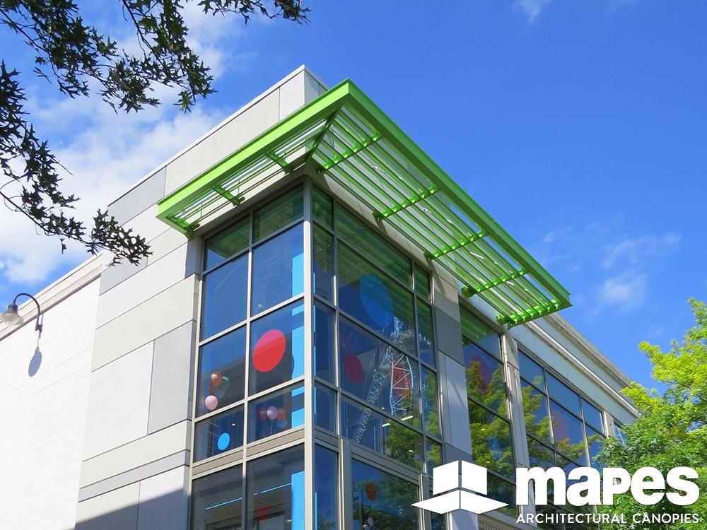
The building was existing, the business district has an inviting feel and the demographics are very supportive. The challenge was in creating an inviting storefront and access to the second floor space over 1st floor retail space for the purpose of a Children’s creative learning center. Brown Craig Turner Architects accomplished this nicely and is inviting to all ages. One of the elements that plays an important role in emotional identity for children and place finding for adults and offers shading functionality was in using a Mapes SuperShade at the top of the updated stair tower. Situated on the corner of the building and at the top of the stair/elevator tower is a custom painted bright green Mapes SuperShade that wraps the building corner. The sunshade is not large, but it has an open view to the street scape below and is very visible from at least a block away to assist in locating the address. Approaching it on foot, the green color jumps out at you from the sidewalk below and combined with other primary colors, appeals to children immediately and they are drawn to the building entrance to look up at the intriguing bright green “thing” way up there, where they are going.
This use of the Mapes SuperShade fulfills several important needs and validates the fact that colors are both eye catching and powerful in their invite to customers. More so than typical architectural finishes and well worth a nominal additional cost for that power of attraction. Plus, you have the advantage of sunshade functionality and quicker way finding with customers. This is a win, win and win project!
Project Details
Project: Make Meaning Children’s Learning Center
Canopy Style: SuperShade sunshade
Location: Bethesda, MD
Mapes Product Number: M-7209
Architect: Brown Craig Turner, Baltimore, MD

